
 Being able to choose the colours for your new home after years of being stuck in neutral while renting is one of the most exciting parts of getting a new home.
Unfortunately, when it comes time to select the colours, people become indecisive. Being too scared to make a bold decision, they revert back to the neutral choices they thought were so boring.
There’s a whole study of the psychology behind colours (we’ve talked about what your fave paint colour says about you!). Certain colours can make you feel more relaxed or energized. Using colour to capture the mood you want is a great way to set the tone for your home.
Don’t be afraid to use some colour in your space. We offer suggestions for each of the rooms in your new home, but be sure to choose something that’s right for you.
The Kitchen
In the kitchen, you usually want something that’s bright and energizing. The bulk of the colour in a kitchen comes from the cabinetry, and most people prefer to stick with the natural colour of the wood or a neutral-coloured paint.
However, you can definitely introduce little pops of colour throughout the space, especially in the backsplash. Yellow, for instance, can really lighten the mood in the kitchen, and it’s an especially good choice for kitchens that don’t get a lot of natural light.
 Bathrooms
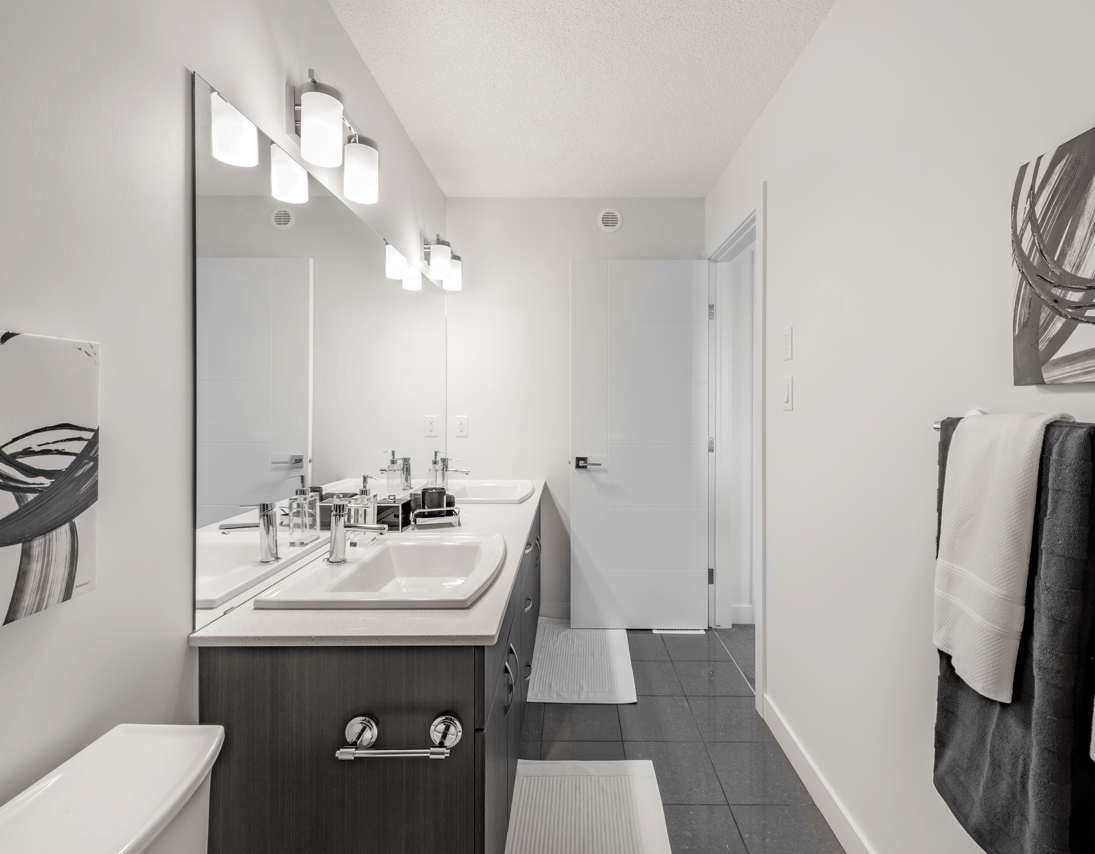
The colour white gives off the feeling of cleanliness, so a lot of people prefer this colour for the bathroom. It also acts as a nice, neutral backdrop so you can instantly change the look of the room by replacing things like the shower curtain and bath mat with different colours.
On the other hand, the small space may offer the perfect opportunity for you to experiment with a more dramatic colour. For instance, a deep red accessorized with black and white photos in black frames could make you feel empowered and confident. A deep purple colour is bold and can give off that luxurious feel.
The Living Room
Plenty of different colour palettes can work well in the living room. A stately shade of blue – on the walls or just in the curtains and furniture – can create a soothing feel, while using shades of green and brown will give the room a natural look with a restful atmosphere. Either of those would be good choices if you envision yourself relaxing with a good book in the living room.
Orange is an energizing colour, and while you might not want to cover the walls with orange, using splashes of orange in the artwork or on the furniture can help create a fun atmosphere. This colour works well if you want a lively living room where you hang out with friends or hold your family game nights.
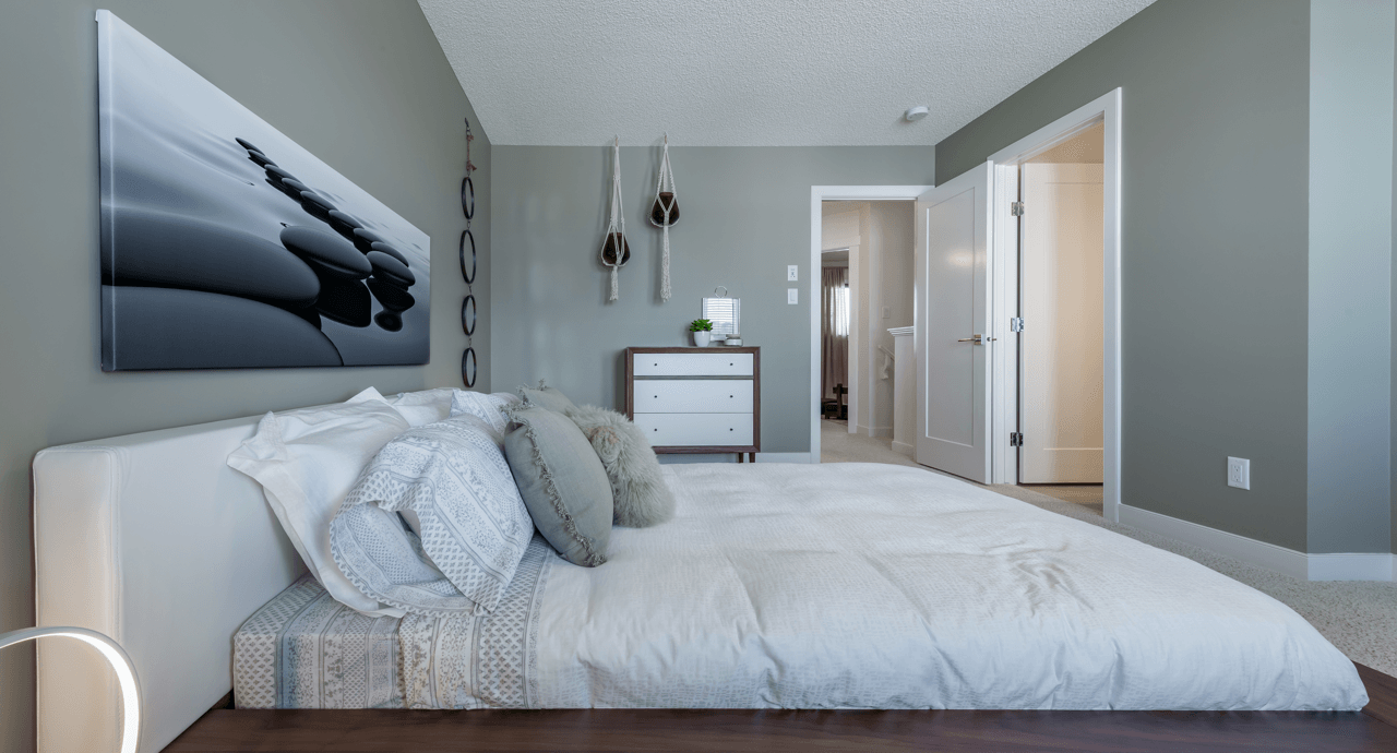
Bedrooms
Naturally, you want your bedroom to be a peaceful space. If you use a lot of reds and yellows in this room, you may have trouble falling asleep. A lot of people use light blue in the bedroom because it tends to have a calming effect, but various shades of green can feel relaxing. Lavender and shades of brown are said to offer comfort in this way as well.
Kids may want to pick their own colours. Encourage them to think of how a certain colour choice could make them feel. For instance, if your daughter wants pink, have her look at a light pink or mauve rather than neon pink.
 Home Office
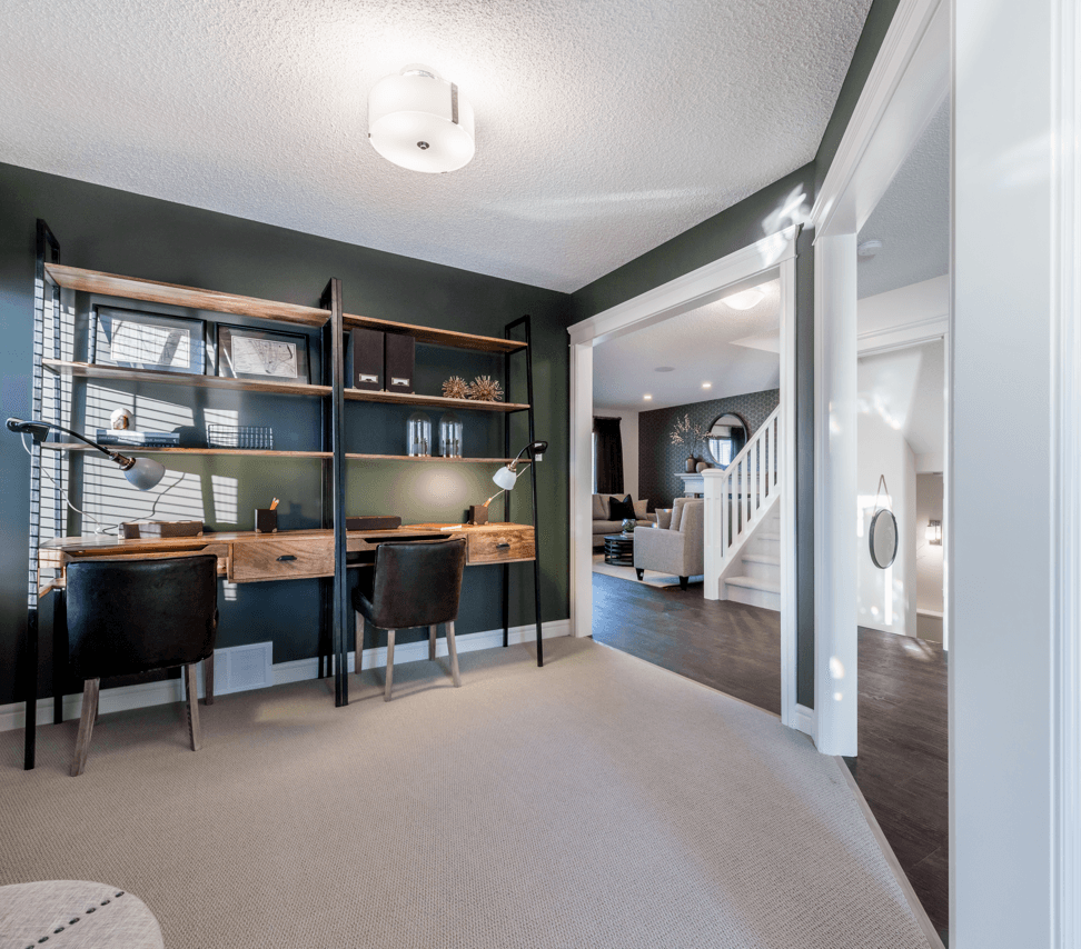
Blue is said to be a colour that increases productivity, so if you have a home office, that’s a good starting point. Anything from sky blue to navy blue can work. The lighter the colour, the more open the space can feel.
Those who have creative professions, though, might feel more inspired with something a little more dramatic. If that sounds like you, look for jewel tones. Purples and greens can be especially good for boosting creativity.
Dining Room
The dining room is another room that can look great in many colours. A toned-down shade of red or orange, for instance, could spice up the room and spark interesting conversations. Some say that red and orange can stimulate the appetite, though, which is why you frequently see these colours in fast food restaurants.
If you worry it might stimulate your appetite too much, consider painting the walls a royal blue with white wainscoting. This lends an air of sophistication to the room. It’s also perfectly acceptable to use neutral colours in the dining room. Greys that have blue undertones are particularly popular. Neutral colours put the focus properly on the food and the company present in the room.
While you undoubtedly want to get the paint colours right when you’re building your home, the great thing about paint is that it’s so easy to change. Choose colours that fit your style now, then make some changes a few years down the road if you’re looking to set a different mood.
You can also play around with your paint application techniques to achieve particular looks and see how they make you feel!